Thomas Schatz believes that there are only two genres:
Genres of order (western, gangster, sci-fi etc)
Hero - Individual, male - dominant
Setting - Contested space which is argued over (ideologically unstable)
Conflict - Externalised, against others (expressed through violence)
Resolution/ending - Elimination (death)
Thematics - The hero takes upon himself the problems, contradictions of his society and saves us from them
- Macho code of behaviour
- Isolated self-resiliance (either through his departure or death, the hero does not fit in with the values /lifestyles of the community but maintains individuality)
Genres of Integration (Musicals, comedies, domestic melodramas etc)
Hero - Couple or collective e.g. family
Setting - Civilised space (ideologically stable)
Conflict - Internalised - between themselves (expressed through emotion)
Resolution/ending - embrace (love)
Thematics - The romantic couple or family are integrated into the wider community, their personal antagonists resolved
- Maternal, familiar code
- Community co-operation
'Genres of order' is the genre that relates to 'Arcane'. Throughout our Teaser Trailer we have featured each of the above elements, although some elements e.g. Resolution cannot be shown or revealed in the Trailer, ultimately adding more suspense and mystery for the viewer.
Showing posts with label Arcane. Show all posts
Showing posts with label Arcane. Show all posts
Monday, 4 March 2013

Sunday, 24 February 2013
Initial Website Draft
These are the stills from our initial website draft.
Home Page
- We decided to apply a background image that had a large relevance to our film. Using a landscape photograph of the Thames with the Houses of Parliament as our background informs the viewer that a large proportion of our trailer is set in Central London. We made our background image full screen.
Throughout our Teaser Trailer we altered the colour of each moving image, and layered a coloured wash over the shots to make the images appear more dark, sinister and ultimately, it uses an Action/Thriller convention. We edited our background image, by increasing the contrast and shadow, whilst applying a very subtle colour wash.
- We inserted and uploaded our Teaser Trailer to the Home Page. Once the Home Page loads, the Trailer plays automatically, and has been positioned in the centre of the screen underneath the Film Title and above the Film Awards. As you can see below in our Screen Shot, the Trailer has a black border around the left and right side, and have given the trailer the 'Video Default' setting.
- We decided to position and place our Film Title 'Arcane' in the centre of our Home Page. The Wix settings would not allow us to use our desired font that we used in our Trailer. In order to overcome this we copy an pasted our background image into 'Paint' and placed the wording 'Coming Soon', 'Arcane' and 'Nominated for the Film of the year by the London Film Critics' Circle' over the image in individual text boxes. Once we had saved this as an image, we uploaded and saved it as our background image on our website.

About The Film
- We added the link 'About the Film' to the top of our Home Page. It has been written in white and in capitals. Once the link has been selected the wording changes from white to black to show the user which one has been selected. Each link has been separated by a plain thin black line.
- The wording 'Page under Construction' in capitals appears when the link has been selected.
- We used consistent fonts throughout (except for the Film Title) where we used Arial in capitals.

Cast
- Under the link 'Cast' we uploaded images of each cast member featuring in our Teaser Trailer. We took these shots in London when we were filming. Not only does it demonstrate what they look like to the viewer but it also shows the outfits that they are wearing.
- Next to each image we have written the Actor's names and their character names, along with 'Actor Information coming soon'.
- Again we kept the same font, using Arial in Capitals and in the colour white. The reason for this is because white stands out and appears more bold against our edited background.

- The majority of these images below were taken in London. They demonstrate the London Eye, New Change Shopping Centre, The Thames. We also took some location shots in Tunbridge Wells in the Car Park and on the rooftop. Again, we edited several images to make them appear more gloomy and dark.
- When the user hovers over each image with their mouse, the location shots become transparent and the location of each image is displayed.

Social Networking links
- We have provided links for our Social Networking sites and more. In the top right hand corner on each page we have provided emoticons for Facebook, Twitter and Blogger. When the user clicks on these links, they are transferred directly to their desired website. We kept on emoticons very simple and in the colour white, which is in keeping with the overall theme of our website.
City Productions
- In the top left hand corner of each page we decided to place 'City Productions' in white to inform the user. We are yet to produce a logo for the 'City Productions' company.
Saturday, 23 February 2013
Website Ideas - Awards
After researching a number of official film websites, we are currently
considering featuring awards which our film ‘Arcane’ has won on our own
homepage. After researching the official
websites of popular films such as ‘The Artist’, ‘Argo’ and ‘Life of Pi’, we
discovered that they all display their achievements in cinema to promote
themselves. If a film has received
multiple accolades from recognized and trustworthy sources, then it triggers
curiosity in the public as to why they are so highly recommended.


Below is an image of how we will present our film's awards on the website homepage if we do go through with the concept.

Thursday, 21 February 2013
Initial Poster Draft (Poster 2)
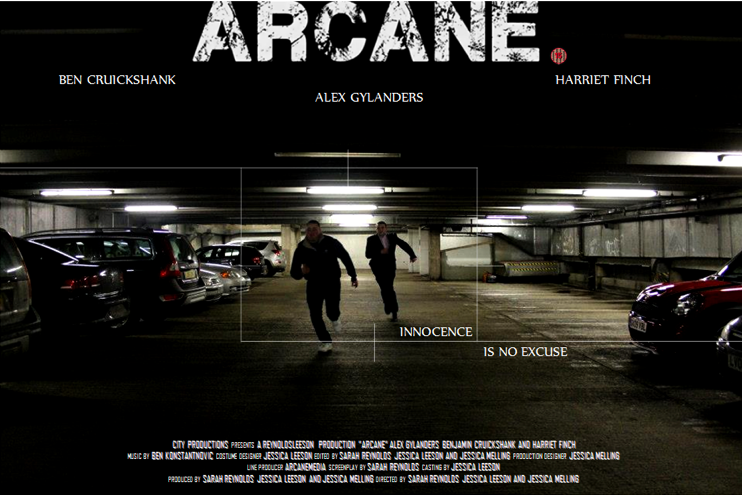
This is our initial Poster Draft.
We previously posted our Poster Deconstructions of 'The Bourne Identity', 'The Bourne Legacy', 'Limitless', 'Enemy of the State' and 'Die Hard'. The reason why we looked at existing posters prior to producing our own is to look at conventions and similarities.
We provided a link to our survey which was primarily used to help demonstrate which poster appealed more to our viewers. The table below shows our results.

Poster 2 (which is the draft image above) has received 72.4% compared with Poster 1 which was given 27.6%. It is evidently clear that Poster 2 is the most appealing, which is why we have selected this particular poster as our Draft.
The Title has been modified by changing the font. We have used the font which appears in our Teaser Trailer and on our website to keep it consistent throughout. Placing the white title over the black background helps it to stand out and makes it appear more bold. All of the typography that is visible on the Poster is in capitals.
We have positioned the target slightly lower and have closed it in a little to create more of a focus on our main character.
The Poster credits have taken inspiration from other poster designs, where the font, size, colour and overall layout have strong similarities. We decided to position the credits centrally at the bottom.
Finally, we added an 'Age Rating' next to the title on the right hand side. This informs the viewer on whether it is suitable for themselves to view this particular film or not.
Monday, 11 February 2013
DECONSTRUCTION: Bourne Legacy Website
This is the first of our website deconstructions. By looking at existing media products, we can see what ours should be like and discover the conventions.


DECONSTRUCTION: Die Hard Website
This is the second website deconstruction which enabled us to look at more existing media products before creating our own.

Friday, 8 February 2013
First Draft Trailer Feedback
Upon finishing the first draft of our trailer, we decided to publish it on YouTube. This would act as a useful service for receiving constructive criticism from the public, allowing us to improve our product further. We have also shown our trailer to our media teachers for the same reasons.
After receiving audience feedback and reviewing the draft ourselves, we have created a list of the trailer's strengths and weaknesses to work from.
Strengths
- Sticks to the conventions of a teaser trailer: 1 minute and 24 seconds in length, begins with showing the film’s production companies, has been created intentionally for marketing/to build anticipation for the film’s release, ‘teases’ the audience with short snippets from the film (establishing the concept and genre of the film but without revealing too much of the plot), ends conventionally by informing the audience of the film’s title and stating that it is 'coming soon' rather than providing a specific date.
- Sticks to the conventions of the 'Action-Thriller' genre: has the concept of a male protagonist fighting for survive, a government body act as an adversary, use of enigmas, striking establishing shots, multiple chase scenes which use tracking/panning shots, urban setting, effective use of both high key and low key lighting, fast paced editing, variety of transitions (mainly jump cuts), dramatic climaxing music, use of a tag line, edgy typography.
Weaknesses
- The trailer does not contain any reviews or awards it has received, a missing feature which would generate more interest in our impressionable target audience.
- The trailer does not include a 'billing block' of film credits at the end, with only the words 'coming soon' being shown. This is unconventional for any teaser trailer, as it is often considered an essential feature.
- The footage used forms too much of a coherent whole, potentially spoiling the film's plot by being too chronological.
Thursday, 31 January 2013
Initial Poster Designs
These are our initial ideas for our Film Poster. Whilst shooting in Tunbridge Wells we decided to take numerous photographic evidence of our time throughout filming. We then used specific images that we think would be ideal for our Poster.
.png)
This is the first design for our Poster. We decided to take a scene from within our trailer, so our viewers could relate it to both the Poster and the Trailer.
Taking note of codes and conventions I used plain white Arial font in capitals for the majority of the text on the Poster. Existing Posters such as Limitless and The Bourne Identity have used Arial Fonts in white either in the centre or at the bottom. We went against this convention and positioned our title centrally at the top.
On Microsoft Word I edited and enhanced the image by increasing the contrast and darkness. This created a more 'moody' and 'negative' effect to the Poster, whilst enhancing and improving the quality.
We previously deconstructed the Enemy of the State and The Bourne Identity Poster, both of which had a subtle target that was placed directly over the top of the main characters, and so I experimented and created this target on Microsoft Word.
The positioning of the Actors' names also plays an importance. 'Alex Gylanders' is our main character as so we positioned him centrally, which is where the viewers' eyes land.
Taking note of codes and conventions I used plain white Arial font in capitals for the majority of the text on the Poster. Existing Posters such as Limitless and The Bourne Identity have used Arial Fonts in white either in the centre or at the bottom. We went against this convention and positioned our title centrally at the top.
On Microsoft Word I edited and enhanced the image by increasing the contrast and darkness. This created a more 'moody' and 'negative' effect to the Poster, whilst enhancing and improving the quality.
We previously deconstructed the Enemy of the State and The Bourne Identity Poster, both of which had a subtle target that was placed directly over the top of the main characters, and so I experimented and created this target on Microsoft Word.
The positioning of the Actors' names also plays an importance. 'Alex Gylanders' is our main character as so we positioned him centrally, which is where the viewers' eyes land.
.png)
This is our second design for our Poster. As demonstrated this appears to be more of a thriller compared to the first design which does not relate to the action genre.
We guided our actor's and asked them to perform a chase scene within Tunbridge Wells Car Park. Whilst doing this we took continuous shots of them both running. From a selection of five, we chose this image above.
We believe that this particular shot captures a lot of action and informs the viewer that the Poster is representing an Action/Political Thriller.
I have also used the same font and colour compared to the first design, as well as the positioning of the subtle white target directly highlighting the protagonist.
This poster is a lot more dark and sinister, which truly represents a Thriller Poster. Darkness represent isolation, fear, anxiety, secretive etc which all are reflected in the Trailer.
We have created a survey for our target market to complete which will help us develop their chosen poster to our final design. The survey can be found here.
Friday, 11 January 2013
Typography

 1. The first is a sans serif font with white lines cutting across the black text. This distorted effect could be ideal for our film as it suggests disruption.
 2. The second font is in the style of those used on a top secret file. This links to the idea of the government scandal and mystery surrounding this.
 3. The third is a serif font that has been distorted in ways. This has aesthetics that can link to the military and government.
 4. The fourth font is reflective of an old typewriter, and with that there is a link to files, and secret files. It is a fairly simplistic serif font that could be effective in the titles of our trailer.
5. The final font has the same distorted effect as
the third and has the silhouettes of a city skyline. This reflects our location (as being London) and disruption that is key in our plot.
The font we have decided to use for the title of our film is the 2nd as it has significant links to our plot and reflects the genre well.
Wednesday, 14 November 2012
Storyboard: Version 1
Below is an image of our completed storyboard (first version), a clear guide as to how we should go about shooting our desired trailer.

Wednesday, 7 November 2012
Questionnaire Results
We collaborated all of our research up to now to compose a questionnaire.
We conducted a questionnaire and received feedback from 30 of our target audience. We then put these results into a video which can be seen below.
Wednesday, 10 October 2012
Film Title
The film title is a crucial aspect of any film. It is what will capture the interest of potential audiences and make suggestions towards the genre and even plot of a film. However, there has to be an air of mystery about it, so as not to give too much away. We thought of a selection of potential titles for our film, as follows:
Confidential - definition: in strict privacy or secrecy
Confidential - definition: in strict privacy or secrecy
Classified - definition: available only to authorised persons
Scandal - definition: a disgraceful or discreditable action, circumstance, etc
Ignominy - definition: disgrace, dishonour, public contempt
Opprobrium - definition: the disgrace or the reproach incurred by conduct considered outrageously shameful; infamy
Liberal - definition: favourable to progress or reform, as in political or religious affairs
Conservative - definition: disposed to preserve existing conditions, institutions etc, or to restore traditional ones, and to limit change
Allegations - definition: an assertion made with little or no proof
Arcane - definition: known or understood by very few; mysterious; secret; obscure
We will incorporate a question concerning the title in our questionnaire that will be conducted shortly and the results posted thereafter.
We will incorporate a question concerning the title in our questionnaire that will be conducted shortly and the results posted thereafter.
Monday, 1 October 2012
SoundCloud
We are currently considering using a soundtrack to overlay
our teaser trailer, as this seems to be a common trend in current film marketing. After researching music sharing sites such as
‘MySpace’, ‘Last.fm’ and ‘8tracks’, we have recently discovered the website
‘SoundCloud’.
As mentioned in our ‘Problems and Solutions’ post, SoundCloud
is an online audio distribution platform which allows the ‘collaboration promotion
and distribution of audio recordings by users’.
It was founded in 2007 by sound designer Alex Ljung and artist Eric
Wahlforss, and has since accumulated over 20 million users (growing by 1.5
million every month). On SoundCloud we
have found a number of potentially useable soundtracks available for free download, with permission from the creator to adapt and
publish them. This tool may save considerable
time during our project, as our group does not have the ability to compose and
create our own professional sounding music.


Thursday, 27 September 2012
Problems and Solutions
Whilst planning the construction of our film trailer, we discovered several problems which we may encounter in the future. To ensure these issues were eliminated as quickly as possible, we organised a brainstorming session to create potential solutions. Overall we were able to produce a practical solution for every problem that may occur in future creative processes, and below is a photograph of said list.


Subscribe to:
Posts (Atom)