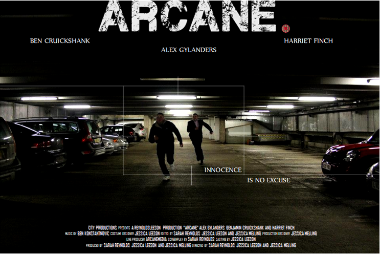
This is our initial Poster Draft.
We previously posted our Poster Deconstructions of 'The Bourne Identity', 'The Bourne Legacy', 'Limitless', 'Enemy of the State' and 'Die Hard'. The reason why we looked at existing posters prior to producing our own is to look at conventions and similarities.
We provided a link to our survey which was primarily used to help demonstrate which poster appealed more to our viewers. The table below shows our results.

Poster 2 (which is the draft image above) has received 72.4% compared with Poster 1 which was given 27.6%. It is evidently clear that Poster 2 is the most appealing, which is why we have selected this particular poster as our Draft.
The Title has been modified by changing the font. We have used the font which appears in our Teaser Trailer and on our website to keep it consistent throughout. Placing the white title over the black background helps it to stand out and makes it appear more bold. All of the typography that is visible on the Poster is in capitals.
We have positioned the target slightly lower and have closed it in a little to create more of a focus on our main character.
The Poster credits have taken inspiration from other poster designs, where the font, size, colour and overall layout have strong similarities. We decided to position the credits centrally at the bottom.
Finally, we added an 'Age Rating' next to the title on the right hand side. This informs the viewer on whether it is suitable for themselves to view this particular film or not.
No comments:
Post a Comment