How did you use media technologies in the construction, research, planning and evaluation stages?
Showing posts with label Leeson. Show all posts
Showing posts with label Leeson. Show all posts
Sunday, 24 March 2013

Friday, 22 March 2013
Evaluation Question 2
How effective is the combination of your Main Product and your Ancillary Tasks?
Wednesday, 20 March 2013
Evaluation Question 1
In what ways does your media product use, develop or challenge forms and conventions of real media products?
After exporting our video from iMovie, there was a glitch in the video which has caused our music from our trailer to play over the top of a section.
The following transcript is what should be heard:
"One of the conventions we challenged was the idea of having a voiceover. We found that generally in a teaser trailer, the voiceover was speech from part of the film, which is proven in the trailer for Man of Steel.
(Voiceover) One day, you're gonna have to make a choice.
This adds to the air of mystery and grabs the viewers attention, however we found this was not necessary or suited to our trailer.
(Voiceover) Stay safe.
(Voiceover) What do you want from me?
We tried using a voiceover and found that it took away from the look of the trailer, so decided against it. We do not feel that this hindered our trailers appeal as it meant that the audience are more focussed on the shots and what they are being shown."
Monday, 4 March 2013
Thomas Schatz Genre Theory (1981)
Thomas Schatz believes that there are only two genres:
Genres of order (western, gangster, sci-fi etc)
Hero - Individual, male - dominant
Setting - Contested space which is argued over (ideologically unstable)
Conflict - Externalised, against others (expressed through violence)
Resolution/ending - Elimination (death)
Thematics - The hero takes upon himself the problems, contradictions of his society and saves us from them
- Macho code of behaviour
- Isolated self-resiliance (either through his departure or death, the hero does not fit in with the values /lifestyles of the community but maintains individuality)
Genres of Integration (Musicals, comedies, domestic melodramas etc)
Hero - Couple or collective e.g. family
Setting - Civilised space (ideologically stable)
Conflict - Internalised - between themselves (expressed through emotion)
Resolution/ending - embrace (love)
Thematics - The romantic couple or family are integrated into the wider community, their personal antagonists resolved
- Maternal, familiar code
- Community co-operation
'Genres of order' is the genre that relates to 'Arcane'. Throughout our Teaser Trailer we have featured each of the above elements, although some elements e.g. Resolution cannot be shown or revealed in the Trailer, ultimately adding more suspense and mystery for the viewer.
Genres of order (western, gangster, sci-fi etc)
Hero - Individual, male - dominant
Setting - Contested space which is argued over (ideologically unstable)
Conflict - Externalised, against others (expressed through violence)
Resolution/ending - Elimination (death)
Thematics - The hero takes upon himself the problems, contradictions of his society and saves us from them
- Macho code of behaviour
- Isolated self-resiliance (either through his departure or death, the hero does not fit in with the values /lifestyles of the community but maintains individuality)
Genres of Integration (Musicals, comedies, domestic melodramas etc)
Hero - Couple or collective e.g. family
Setting - Civilised space (ideologically stable)
Conflict - Internalised - between themselves (expressed through emotion)
Resolution/ending - embrace (love)
Thematics - The romantic couple or family are integrated into the wider community, their personal antagonists resolved
- Maternal, familiar code
- Community co-operation
'Genres of order' is the genre that relates to 'Arcane'. Throughout our Teaser Trailer we have featured each of the above elements, although some elements e.g. Resolution cannot be shown or revealed in the Trailer, ultimately adding more suspense and mystery for the viewer.
Rick Altman Genre Theory (1999)
Genre offers audiences 'a set of pleasures'
Emotional Pleasures - The emotional pleasures offered to audiences of genre films are particulary significant when they genreate a strong audience response.
Visceral Pleasures - Visceral pleasures are 'gut' responses and are defined by how the film's stylistic construction elicits a physical effect upon its audience. This can be a feeling of revulsion, kinetic speed or a 'roller coaster ride'.
Intellectual Puzzles - Certain film genres such as the thriller offer the pleasure in trying to unravel a mystery or a puzzle. Pleasure is derived from deciphering the plot and forecasting the end or being surprised by the unexpected.
Our Teaser Trailer relates to the 'Intellectual Puzzles'. One of the conventions of a teaser trailer is the 'mystery' that it holds for the viewer. The purpose of the film is to help the viewer 'unravel a mystery or puzzle', and so throughout the whole film the viewer will understand and establish the majority of our plot.
Emotional Pleasures - The emotional pleasures offered to audiences of genre films are particulary significant when they genreate a strong audience response.
Visceral Pleasures - Visceral pleasures are 'gut' responses and are defined by how the film's stylistic construction elicits a physical effect upon its audience. This can be a feeling of revulsion, kinetic speed or a 'roller coaster ride'.
Intellectual Puzzles - Certain film genres such as the thriller offer the pleasure in trying to unravel a mystery or a puzzle. Pleasure is derived from deciphering the plot and forecasting the end or being surprised by the unexpected.
Our Teaser Trailer relates to the 'Intellectual Puzzles'. One of the conventions of a teaser trailer is the 'mystery' that it holds for the viewer. The purpose of the film is to help the viewer 'unravel a mystery or puzzle', and so throughout the whole film the viewer will understand and establish the majority of our plot.
Sunday, 3 March 2013
Tom Ryall Genre Theory (1978)
Ryall proposes the theory that the types of conventions found in genres can be grouped within the following categories:
Iconographies - Symbolic symbols associated with the genre
Narrative - Structure, open/closed
Representations - Characters/Stereotypes
Ideologies - Beliefs and ideas of the 'ideal' concept, themes
If we recognise the genre of a text it enables us to feel at home and we gain enjoyment from "spotting the conventions" (repetitions) and making comparisons with other films of the same genre.
If a text deviates from the conventions, it can confuse us, but at the same time we enjoy seeing the rules broken, providing that the film-maker doesn't go too far.
Genre offers audiences a structure enabling us to feel secure in our knowledge.
Audiences like the anticipation of watching for the predictable features.
- Our Teaser Trailer does hold the convention of keeping the story-line a mystery to the viewer, nevertheless Ryall's theory does apply to our trailer. Throughout the trailer, we have applied many Action/Thriller conventions e.g. Located in a built up city, victim and a villain, chase scenes etc, which is ultimately what the audience will be expecting. However, to create an increased element of surprise, we have gone against and contradicted certain conventions to ensure that we keep the viewers entertained throughout.
Iconographies - Symbolic symbols associated with the genre
Narrative - Structure, open/closed
Representations - Characters/Stereotypes
Ideologies - Beliefs and ideas of the 'ideal' concept, themes
If we recognise the genre of a text it enables us to feel at home and we gain enjoyment from "spotting the conventions" (repetitions) and making comparisons with other films of the same genre.
If a text deviates from the conventions, it can confuse us, but at the same time we enjoy seeing the rules broken, providing that the film-maker doesn't go too far.
Genre offers audiences a structure enabling us to feel secure in our knowledge.
Audiences like the anticipation of watching for the predictable features.
- Our Teaser Trailer does hold the convention of keeping the story-line a mystery to the viewer, nevertheless Ryall's theory does apply to our trailer. Throughout the trailer, we have applied many Action/Thriller conventions e.g. Located in a built up city, victim and a villain, chase scenes etc, which is ultimately what the audience will be expecting. However, to create an increased element of surprise, we have gone against and contradicted certain conventions to ensure that we keep the viewers entertained throughout.
Sunday, 24 February 2013
Initial Website Draft
These are the stills from our initial website draft.
Home Page
- We decided to apply a background image that had a large relevance to our film. Using a landscape photograph of the Thames with the Houses of Parliament as our background informs the viewer that a large proportion of our trailer is set in Central London. We made our background image full screen.
Throughout our Teaser Trailer we altered the colour of each moving image, and layered a coloured wash over the shots to make the images appear more dark, sinister and ultimately, it uses an Action/Thriller convention. We edited our background image, by increasing the contrast and shadow, whilst applying a very subtle colour wash.
- We inserted and uploaded our Teaser Trailer to the Home Page. Once the Home Page loads, the Trailer plays automatically, and has been positioned in the centre of the screen underneath the Film Title and above the Film Awards. As you can see below in our Screen Shot, the Trailer has a black border around the left and right side, and have given the trailer the 'Video Default' setting.
- We decided to position and place our Film Title 'Arcane' in the centre of our Home Page. The Wix settings would not allow us to use our desired font that we used in our Trailer. In order to overcome this we copy an pasted our background image into 'Paint' and placed the wording 'Coming Soon', 'Arcane' and 'Nominated for the Film of the year by the London Film Critics' Circle' over the image in individual text boxes. Once we had saved this as an image, we uploaded and saved it as our background image on our website.

About The Film
- We added the link 'About the Film' to the top of our Home Page. It has been written in white and in capitals. Once the link has been selected the wording changes from white to black to show the user which one has been selected. Each link has been separated by a plain thin black line.
- The wording 'Page under Construction' in capitals appears when the link has been selected.
- We used consistent fonts throughout (except for the Film Title) where we used Arial in capitals.

Cast
- Under the link 'Cast' we uploaded images of each cast member featuring in our Teaser Trailer. We took these shots in London when we were filming. Not only does it demonstrate what they look like to the viewer but it also shows the outfits that they are wearing.
- Next to each image we have written the Actor's names and their character names, along with 'Actor Information coming soon'.
- Again we kept the same font, using Arial in Capitals and in the colour white. The reason for this is because white stands out and appears more bold against our edited background.

- The majority of these images below were taken in London. They demonstrate the London Eye, New Change Shopping Centre, The Thames. We also took some location shots in Tunbridge Wells in the Car Park and on the rooftop. Again, we edited several images to make them appear more gloomy and dark.
- When the user hovers over each image with their mouse, the location shots become transparent and the location of each image is displayed.

Social Networking links
- We have provided links for our Social Networking sites and more. In the top right hand corner on each page we have provided emoticons for Facebook, Twitter and Blogger. When the user clicks on these links, they are transferred directly to their desired website. We kept on emoticons very simple and in the colour white, which is in keeping with the overall theme of our website.
City Productions
- In the top left hand corner of each page we decided to place 'City Productions' in white to inform the user. We are yet to produce a logo for the 'City Productions' company.
Friday, 22 February 2013
Final Poster Design
After deconstructing existing posters, designing our own posters and developing our draft, this is our final design of our poster.

We have changed various aspects of our draft in order to develop and finalize our poster design:
- We have changed the tagline, 'Innocence is no excuse', to Italics. This represents and reflects the characters' movement and action
- We have lowered the title 'Arcane', as we could not find any existing action thriller posters that did this
- Audience feedback suggested that the target was too faint, and so we increased the intensity and thickness of the line
- We also enclosed the target more so it appears more focused on the main character i.e the protagonist
- We altered the tagline font, and made it to plain white Arial in capitals
Thursday, 21 February 2013
Initial Poster Draft (Poster 2)
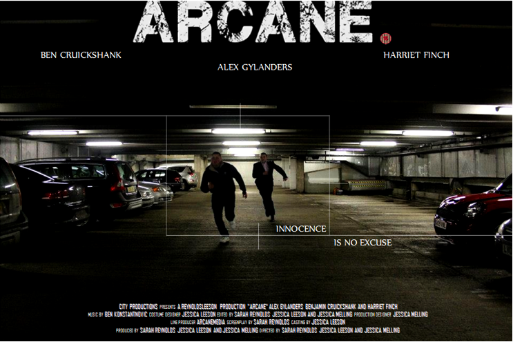
This is our initial Poster Draft.
We previously posted our Poster Deconstructions of 'The Bourne Identity', 'The Bourne Legacy', 'Limitless', 'Enemy of the State' and 'Die Hard'. The reason why we looked at existing posters prior to producing our own is to look at conventions and similarities.
We provided a link to our survey which was primarily used to help demonstrate which poster appealed more to our viewers. The table below shows our results.

Poster 2 (which is the draft image above) has received 72.4% compared with Poster 1 which was given 27.6%. It is evidently clear that Poster 2 is the most appealing, which is why we have selected this particular poster as our Draft.
The Title has been modified by changing the font. We have used the font which appears in our Teaser Trailer and on our website to keep it consistent throughout. Placing the white title over the black background helps it to stand out and makes it appear more bold. All of the typography that is visible on the Poster is in capitals.
We have positioned the target slightly lower and have closed it in a little to create more of a focus on our main character.
The Poster credits have taken inspiration from other poster designs, where the font, size, colour and overall layout have strong similarities. We decided to position the credits centrally at the bottom.
Finally, we added an 'Age Rating' next to the title on the right hand side. This informs the viewer on whether it is suitable for themselves to view this particular film or not.
Monday, 11 February 2013
DECONSTRUCTION: Bourne Legacy Website
This is the first of our website deconstructions. By looking at existing media products, we can see what ours should be like and discover the conventions.

Thursday, 31 January 2013
Initial Poster Designs
These are our initial ideas for our Film Poster. Whilst shooting in Tunbridge Wells we decided to take numerous photographic evidence of our time throughout filming. We then used specific images that we think would be ideal for our Poster.
.png)
This is the first design for our Poster. We decided to take a scene from within our trailer, so our viewers could relate it to both the Poster and the Trailer.
Taking note of codes and conventions I used plain white Arial font in capitals for the majority of the text on the Poster. Existing Posters such as Limitless and The Bourne Identity have used Arial Fonts in white either in the centre or at the bottom. We went against this convention and positioned our title centrally at the top.
On Microsoft Word I edited and enhanced the image by increasing the contrast and darkness. This created a more 'moody' and 'negative' effect to the Poster, whilst enhancing and improving the quality.
We previously deconstructed the Enemy of the State and The Bourne Identity Poster, both of which had a subtle target that was placed directly over the top of the main characters, and so I experimented and created this target on Microsoft Word.
The positioning of the Actors' names also plays an importance. 'Alex Gylanders' is our main character as so we positioned him centrally, which is where the viewers' eyes land.
Taking note of codes and conventions I used plain white Arial font in capitals for the majority of the text on the Poster. Existing Posters such as Limitless and The Bourne Identity have used Arial Fonts in white either in the centre or at the bottom. We went against this convention and positioned our title centrally at the top.
On Microsoft Word I edited and enhanced the image by increasing the contrast and darkness. This created a more 'moody' and 'negative' effect to the Poster, whilst enhancing and improving the quality.
We previously deconstructed the Enemy of the State and The Bourne Identity Poster, both of which had a subtle target that was placed directly over the top of the main characters, and so I experimented and created this target on Microsoft Word.
The positioning of the Actors' names also plays an importance. 'Alex Gylanders' is our main character as so we positioned him centrally, which is where the viewers' eyes land.
.png)
This is our second design for our Poster. As demonstrated this appears to be more of a thriller compared to the first design which does not relate to the action genre.
We guided our actor's and asked them to perform a chase scene within Tunbridge Wells Car Park. Whilst doing this we took continuous shots of them both running. From a selection of five, we chose this image above.
We believe that this particular shot captures a lot of action and informs the viewer that the Poster is representing an Action/Political Thriller.
I have also used the same font and colour compared to the first design, as well as the positioning of the subtle white target directly highlighting the protagonist.
This poster is a lot more dark and sinister, which truly represents a Thriller Poster. Darkness represent isolation, fear, anxiety, secretive etc which all are reflected in the Trailer.
We have created a survey for our target market to complete which will help us develop their chosen poster to our final design. The survey can be found here.


Wednesday, 23 January 2013
Character Photography


Whilst filming in London we thought it would be best to photograph our three main characters. Not only do the photographs demonstrate their appearance, but it also shows each characters' outfit.
Sunday, 6 January 2013
Action Vs. Thriller
As previously mentioned here, we decided to change our genre to an Action Thriller. Originally, we took inspiration from conspiracy thriller films such as Enemy of the State, The Bourne Films, Limitless and many more. Nevertheless, when it came to selecting our cast, our main character's presence seemed to alter the genre.
We decided to explore the different conventions when looking at both the Action and Thriller genre. When filming and editing takes place we will combine both aspects to create an Action Thriller film Trailer.

Saturday, 5 January 2013
Initial Location Shots
Before filming with our main characters we decided to visit London to take some initial opening location shots for our trailer. We also took photos of various areas in London e.g. Leicester Square, London Eye, Parliament, ‘New Change’ Shopping Centre Rooftop. The locations that we have used will notify the viewer, and will become evident to them that it is set in London.This particular visit up to London helped organize and highlight any other locations which would be suitable to use. In our previous post we mentioned the 'New Change' Rooftop which we believed would be appropriate to feature within our trailer. Demonstrated below are some of the images that we took on the Rooftop.


Thursday, 3 January 2013
Production Company
A production company is key in the making of a film, as it can carry conventions of what to expect from a film under that company and acts as an investor for a film, allowing the producers and directors to have a larger budget. We have looked at some production companies to find one appropriate for our film.

Lionsgate are the production company for films including Reservoir Dogs, Total Recall and Young Guns. These films are of the same or a similar genre to ours, making Lionsgate an ideal production company for Arcane.

Universal Pictures are another production company which we thought would relate to Arcane. Films which have used this particular production company include The Boxer, The Fast and Furious, The Bourne series and Smokin' Aces.

The final production company we looked at are 20th Century Fox. Films include Die Hard, Speed and The Day After Tomorrow. These once again relate to our genre, although 20th Century Fox are associated with a wide variety of genres, with other films including Notting Hill, Castaway and Ice Age. This may make it unsuitable for our use.

Instead of using Lionsgate, Universal Pictures and 20th Century Fox, we thought we should create and design our own production company that ultimately sets the physical basis for our film trailer.
Our production company has been called 'City Productions'. By looking at the background image, which displays the London Eye, the viewer automatically knows that this is a British based company. It is a 2 second clip showing the Ferry entering the still shot. Editing the footage to Black and White gives the overall image a 'Traditional' and very 'British' look. We placed a 'Ripple' transition after the two second clip to create a smoother change-over.

Lionsgate are the production company for films including Reservoir Dogs, Total Recall and Young Guns. These films are of the same or a similar genre to ours, making Lionsgate an ideal production company for Arcane.

Universal Pictures are another production company which we thought would relate to Arcane. Films which have used this particular production company include The Boxer, The Fast and Furious, The Bourne series and Smokin' Aces.

The final production company we looked at are 20th Century Fox. Films include Die Hard, Speed and The Day After Tomorrow. These once again relate to our genre, although 20th Century Fox are associated with a wide variety of genres, with other films including Notting Hill, Castaway and Ice Age. This may make it unsuitable for our use.

Instead of using Lionsgate, Universal Pictures and 20th Century Fox, we thought we should create and design our own production company that ultimately sets the physical basis for our film trailer.
Our production company has been called 'City Productions'. By looking at the background image, which displays the London Eye, the viewer automatically knows that this is a British based company. It is a 2 second clip showing the Ferry entering the still shot. Editing the footage to Black and White gives the overall image a 'Traditional' and very 'British' look. We placed a 'Ripple' transition after the two second clip to create a smoother change-over.
Wednesday, 2 January 2013
Location, Location, Location...
For some of our shots, we had the idea to film on a rooftop with our main character, Luke, in a confrontation with the govenment officials. We also want some running shots in a similar urban setting, with inspiration coming from a scene in 'Enemy of the State'. We have found some companies that focus on location shots for moving image and photography. The first is 'Bridge Creative Studios' (see images below).


The next company we found are 'Still Productions', who provide a more extensive range of locations, some of which are shown below. This includes both rooftops and urban settings. We have posted some more images below.


The final location we have looked at is a shopping centre called 'One New Change'. With panormaic views of London, the rooftop overlooks St Pauls Cathedral and would be an ideal location for some of our scenes.


After investigating all these locations, we discovered the first two locations were out of our budget, so we will be considering the third (One New Change).


The next company we found are 'Still Productions', who provide a more extensive range of locations, some of which are shown below. This includes both rooftops and urban settings. We have posted some more images below.


The final location we have looked at is a shopping centre called 'One New Change'. With panormaic views of London, the rooftop overlooks St Pauls Cathedral and would be an ideal location for some of our scenes.


After investigating all these locations, we discovered the first two locations were out of our budget, so we will be considering the third (One New Change).
Friday, 14 December 2012
Alex Gylanders - Actor Photos
These are some photographs of the actor, Alex Gylanders, for our main character, Luke Harris.
These photos are in relation to our previous blog post, whereby we posted the actor introduction video. The photographs enable us to see what he looks like on camera, and how the lighting appears.
We then looked back at our questionnaire results, which can be seen here. The results show that the majority of our target audience preferred a broader character.


Subscribe to:
Posts (Atom)